Some more Ablative Armor history from Carlo Pagulayan
A few weeks ago I revealed a piece of Iron Man art I commissioned. I chose Carlo Pagulayan for the commission of the Model 23 Ablative Armor because he’s one of the only people to provide an official image of it for Marvel. This official image was published in both the All-New Iron Manual and the Iron Manual TPB.
Left: 2008 All-New Iron Manual. Right: 2020 11” X 17” pencil commission.
In that recent blog linked above, I started musing about Mr. Pagulayan’s interpretation of the circle on the back of the Ablative’s hand. He interpreted it as some sort of hand cannon in 2008 and brought that over to his 2020 commission piece as well. How did he reach that conclusion?
Let’s Ask Him!
I contacted Mr. Pagulayan directly, and he has been kind enough to share his thoughts with ironmanablativearmor.com.
“Originally when I was given the page as reference for the Armors, I had drawn it that way because the rendering on the page doesn't have the metal sheen on that circle. It could be a coloring mistake on the page. or it could be a misinterpretation on my end. But it got approved for the Armor Manual. I assumed it was something that opened up, and given how thick the arms/bracers were, it felt like it was hiding something, I wasn't given any note on it either. Hence it continued with the commission.”
When asked about the references he had to work from, Mr. Pagulayan had this to say:
The only reference art was the interior page itself, and that alone. So we had to figure out the rest.
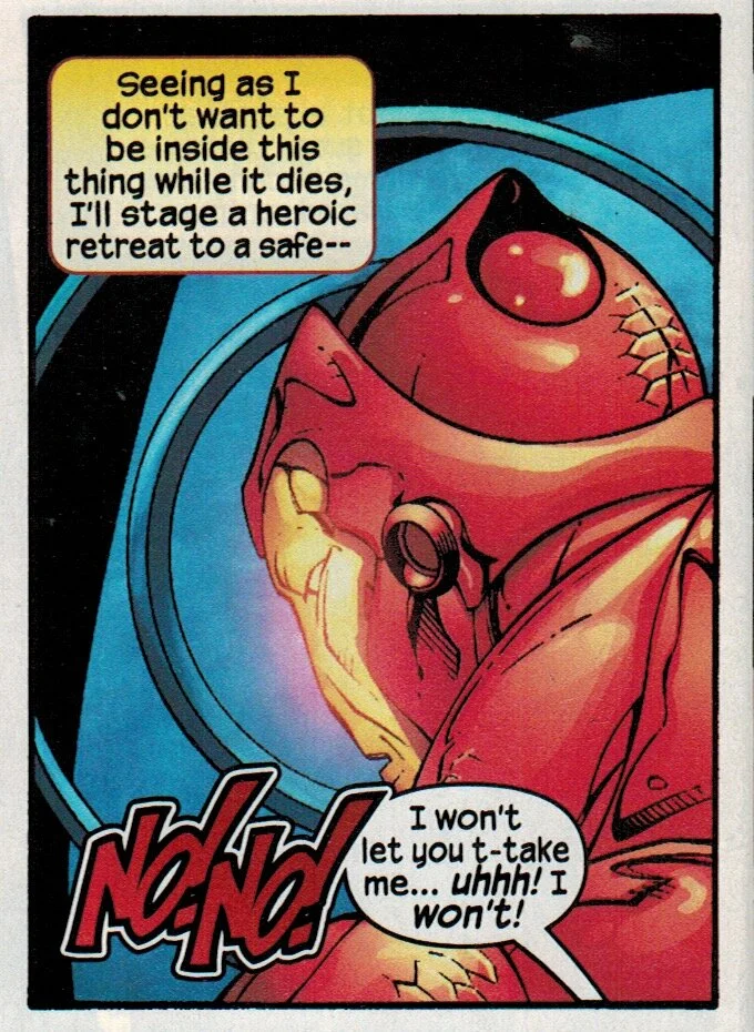
He’s almost certainly talking about this page; it offers the most concentrated and detailed images of the bulk of the suit.

Introduction of Axol (Model 23) from
Iron Man #416.
Having the Ablative look forward makes sense if you only have that page to go by. You have to dig pretty deep into the comic to find the best representation of the back of the helmet, and Marvel didn’t send him this page.
From Iron Man #416.
What About the Black and Gold?
I also asked him about another Iron Man armor – the Model 42 Black and Gold modular armor – that he designed for the 2012 Marvel NOW! Iron Man series (volume 5). I noticed that the Black and Gold also had something glowing on the back of the hand, and I started wondering if, perhaps, in some way, possibly, his All-New Iron Manual pic of the Ablative Armor influenced the Black and Gold just six years later.
Turns out…probably not.
“I can't say for sure if it influenced the Black armor, maybe subconsciously, since It looked cool to me. However the ports on the black armor serve as energy channels / power ports (as Kieron Gillen wanted a modular design where armaments can connect to). It's for defense or offense, depending on what attaches. On its own it probably serves very little for battles, but serves better for maneuvres. However now that you've pointed out the circles in the arms in the Ablative armor, I am now curious if I was wrong to draw it like that hahaha!”
So there you go: Kieron Gillen tasked Mr. Pagulayan with coming up with a modular armor. This armor needed a way to power and communicate with any add-ons, and that explains the glowing ports on the back of the hand. It’s just more proof that artists put in a lot of thought to ground armors in reality, just as I believe Robert Teranishi did for the Ablative design.
Mystery solved? Pretty much.